Friday, November 23, 2018

Understanding Misclassifier


A common issue that has to be addressed during model building  is the understanding the output and churning it . One important understanding is required in the term 'misclassifier'.

It is also required to understand the following terms
True positive , false positive, true negative , false negative.

Depending upon the business / technical problem the important misclassifier  need to be identified and churned .

For instance,
False positive means predicting a negative result as a positive result.

In the below example  a sample fictitious data is used for understanding.
It has 32 variables and 1000 records. The data is scaled suitably to use it for analysis, which is a typical data preprocessing activity.
It is partitioned for testing and training. 80% -20 %

Two models were build- ANN and CRT.

How should we understand the results?


                     Figure1 : Model built- ANN and CRT using SPSS Modeler.


Figure2: Results from CART algorithm 


Figure3: Response from the Artificial and Neural Network. 


Based on the given output by the models the question that arises is which should be chosen ?
Considering the figure 2, the false positive 64 % and the figure 3 gives a result of 55.4 % which mean that the the former model is saying the result as positive which is higher than the ANN model.
What is the conclusion ?
If we are bothered on a model which should say the facts as such , then both of those are dangerous. Say for instance we are working on a hospital data for which treatment is given for  a symptom and the model predicts that the person has a disease. Isn't this dangerous ? Hence work on the  misclassifier and refine the model . 

How to start python / learning programming ?

So, you have researched , googled, and finally came to a conclusion that need python for enhancement in career, business, automation and so on.....But where and how to start.

With my experience in automation,predictive analytics and interest in software, I have touched few points,if you think useful pick those. I walked through all the steps mentioned here.
1.How to start learning python ? Which are the best resources- websites / e- books / institutes/ tutors are the questions that are frequently asked by people ..
 My one line answer is your passion, your interest ,money and the google.
Start from any mode, but start today.
All the text books/ contents/ courses of online can give you information or make you walk around.
In my opinion swimming cannot be taught online. Likewise is the programming.
 You will not have the same set of theoretical programming that you have learnt in labs/ classes in real applications.Therefore the basics can be learnt in 15- 20 hours of simple training- it can even be self taught. I repeat- the word ' PASSION'.
2.You start  a simple program yourself,with a problem statement- addition of two number/ multiplication - logical questions or of any kind - be a self starter- later you can magnify the  problem level and improve  your programming skill.
It needs lot of guts to say this ! The reason being most of the resources give problems and also  solution which hinders our way of thinking. Solve it yourself--- YOU WILL GAIN CONFIDENCE.

3. Time matters- More the time you devote for programming, more will be your ability.

4. There is no substitute for your creativity and problem solving ability- use that. If you have not got any programming exposure- that is the best thing needed- you can think in a different mode.
All you need is the logic and  not the syntax. I know the experts with lot of experience still google for the syntax.
5. The software's capability is infinite- it means the problem you think today might have been experienced by most others years ago. The other skill needed is ' GOOGLING' the solution for your syntax.
While  we study in primary school, we were exposed to the languages,alphabets, words and sentences. Can mugging up an answer for a question help us anywhere ? Similarly is the programming

Know the data types, syntax - for few  and start writing programs. That's all the one you need.
Joining in groups, answering  questions asked in stackoverflow, attending contests can definitely make you pro!!!


Wednesday, September 26, 2018

Python coding

Most often Data science professionals especially who use open source tools like python encounter issues related to date. Conversion to different format, short forms etc. This is an attempt to bring few of  the issues related to date in one window .
How to get the last 6 months from the current date  ->( format May 2018 )?
datelist=[ ]
datem = datetime.date.today().replace(day=1)
for i in range (7):
    x = datem + relativedelta(months=-i)
    x=datetime.datetime.strftime(x,'%b %Y')
    datelist.append(x)
del datelist[0]

Friday, August 24, 2018

Confusion Matrix -- Is it a confusion all the time ?

Part -2 of confusion matrix
How to read a confusion matrix

Supposing the machine predicts that a person gets a particular disease.

 the matrix displays as

Confirmed
Not confirmed
Confirmed
35
20
Not confirmed
25
15

What do you understand? This has to be understood as the rows denote the actual values and the columns form the predicted values. Let us go deep now.

 I have given summation of the rows and columns

Predicted values

Confirmed
Not confirmed
total
Actual values
Confirmed
35
20
55
Not confirmed
25
15
40
total
60
35
95


Here in the above matrix , the important class is 'confirmed.' We don't bother about the other part. 

Now comes the terminologies. Specificity


Again what do we mean? The machine predicts that 35 people has a disease against the total count of 55.
Secondly the machine predicts that 15 people do not have a disease against the total of 40 people without a disease.

What should we take from this ?
35/55  =.6363 or  the specificity is 63 .63 %  We expect the machine to be accurate about 90-95 or still higher as the case may be to predict people with a disease.
 Sensitivity= True positive / (true positive + False negative ) -----> The sensitive part of our problem


Secondly the machine predicts 15/40 don't have a disease. We are not too much bothered about it. 
ie 37.5 %  is the specificity.

Specificity= true negative / ( false positive + true negative)


Wednesday, July 25, 2018

Understanding Time series part-2


Understanding time series- in Layman’s terms
How to start learning time series ?
               You will be lucky enough if you get an opportunity to learn well before you put your hands on in actual work environment, or if the search engine exactly points out where to start. But there are good contents too, which the search engine may not bring in the first page and that is where we miss.
               What is time series?
Any data which has just two columns, date and variable. Even though there may be ‘n’ dependent variable that may not be available for analysis / prediction. Eg- stock price, Gold rates, Energy savings made etc.
               Is it a new topic?
Definitely not, as old as mathematics, but the computational tools re invented them for a next level .
               Where to start?
While there are many sophisticated, dedicated, open source tools available, even excel can also help. Can start with excel and transform to next level using R and Python.  The first and foremost thing is to convert the data as series. For instance , a program is conducted by an utility to save energy for the period of 5 years. You have the data of energy savings from 2012 say Jan 1. If you expect the data as series with a frequency of month you should have atleast 12 x 5 = 60 rows [ records], if daily then[ 365 x 5]There are chances that the data may not be available. Fix it first.
               In R , there are few packages need to be installed. I shall update in the later part of the content. Initially start with ‘tseries’ and ‘forecast’,’fpp2’,’GGally’.  Assign a variable in and put the data as time series using the function ts.
Y<-ts(data,frequency=12,start=c(2012,1))
What to view and understand?
               We look for a trend- upward, downward, flat. Seasonal- varies during a particular month every year [ during Diwali gold prices increase, mangoes and summer]. Thirdly look for cyclical pattern- Weekend sales vs weekday sales.
Graphs to view and understand
               R has lot of packages and options. Start using autoplot(),ggseasonalplot(),ggsubseriesplot(),gglagplot() and ACF. You can try this and update in the comments section.
This topic will be  continued in next post.


Autoplot is a wonderful package which plots the time series. X axis is the  time and y axis has the values.
Plotting is as simple as
               ‘ autoplot(thevariable) ‘
We get a good plot of the variable spread over time. Next step is find the ACF – Auto correlation function.
‘acf(thevariable)
What to understand from it ?
When all the lines are below the  blue band, there is no correlation and the series has random values .
Choosing a part of the time series <- use window command.
Variable<--window(filename,start=1973,end=c(1993,11))
So what else is required ? Analysis and forecasting.
If you want to estimate whether consumption is having any relation with income over time you can use tslm(variable1~variable2, data=)
Forecasting ?
In the next update

Saturday, July 21, 2018

Understanding time series- in Lay-man’s terms


How to start learning time series ?
               You will be lucky enough if you get an opportunity to learn well before you put your hands on in actual work environment, or if the search engine exactly points out where to start. But there are good contents too, which the search engine may not bring in the first page and that is where we miss.
               What is time series?
Any data which has just two columns, date and variable. Even though there may be ‘n’ dependent variable that may not be available for analysis / prediction. Eg- stock price, Gold rates, Energy savings made etc.
               Is it a new topic?
Definitely not, as old as mathematics, but the computational tools re invented them for a next level .
               Where to start?
While there are many sophisticated, dedicated, open source tools available, even excel can also help. Can start with excel and transform to next level using R and Python.  The first and foremost thing is to convert the data as series. For instance , a program is conducted by an utility to save energy for the period of 5 years. You have the data of energy savings from 2012 say Jan 1. If you expect the data as series with a frequency of month you should have atleast 12 x 5 = 60 rows [ records], if daily then[ 365 x 5]There are chances that the data may not be available. Fix it first.
               In R , there are few packages need to be installed. I shall update in the later part of the content. Initially start with ‘tseries’ and ‘forecast’,’fpp2’,’GGally’.  Assign a variable in and put the data as time series using the function ts.
Y<-ts(data,frequency=12,start=c(2012,1))
What to view and understand?
               We look for a trend- upward, downward, flat. Seasonal- varies during a particular month every year [ during Diwali gold prices increase, mangoes and summer]. Thirdly look for cyclical pattern- Weekend sales vs weekday sales.
Graphs to view and understand
               R has lot of packages and options. Start using autoplot(),ggseasonalplot(),ggsubseriesplot(),gglagplot() and ACF. You can try this and update in the comments section.
This topic will be  continued in next post.

Friday, June 29, 2018

Time series analysis

You are new to time series model 
what are the top 5 things you need to know.

  1. check whether the data imported has date in the type of date. A very important step as most of the time it could not be.
  2. There are chances that the dd mm yy  is not read in the same pattern. fix it.
  3. know how to group data /aggregate data weekly,monthly ,seasonal etc 
  4. Sort data according to time, latest first, oldest first, etc
  5. plot graph with different series in same x axis.

Monday, May 7, 2018

Reading a confusion Matrix... A misclassifier


How to read a confusion matrix
suppose you have 95 records available for prediction. The record has a target to predict whether the person has a particular disease or not.
 the matrix displays as

Confirmed
Not confirmed
Confirmed
35
20
Not confirmed
25
15

What do you understand?

 I have given summation of the rows and columns

Predicted values

Confirmed
Not confirmed
total
Actual values
Confirmed
35
20
55
Not confirmed
25
15
40
total
60
35
95

Can you get some information?
The green cells are the actuals, while the yellows are the predicted values and the pink are the errors.
Actual values are the one which are tested physically and the results are available on hand. Which means in our case 55 people had the disease and 40 don’t have.
What did the algorithm do ? It has predicted as 60 people who have disease and 35 who do not have.
How to interpret? Out of the 55 people, the algorithm has made a wrong prediction of classifying 20 people as they don’t have a disease. 
Secondly, out of 45 people who do not have disease it has predicted 25 people that they may have a disease, which is a very serious issue.

Reached 1000...more to go


Saturday, May 5, 2018

Few algorithms a Data science professional should know

1.Perceptron Algorithm
2.Hoeffding's Inequality
3. Data preparation:- Normalisation, Feature scaling, Binary scaling, standardisation
4.Machine Learning algorithms such as Linear , logistic regression, Principal Component analysis,
Artificial Neural Network, K- Nearest Neighbours, Naive bayes, K- means clustering,Support Vector Machine,Random Forerst
5. Validation algorithms

Perceptron Algorithm

1.     Initialize the weights and threshold to small random numbers.
2.     Present a vector to the neuron inputs and calculate the output.
     3.      Update the weights 
     4.       Repeat steps 2 and 3 until:
o   the iteration error is less than a user-specified error threshold or
a predetermined number of iterations have been completed .

Hoeffding’s inequality
    A powerful technique—perhaps the most important inequality in learning theory—for bounding the probability that sums of bounded random variables are too large or too small
x

Univariate Time series

We have a data set which is varying with time. For instance temperatures of  a particular place for the past 20 years. What insight can we have?
1. Plot the entire data as time series
2. Check for any cyclic pattern
3. Plot the mean of the temperature for every season( 3-4 months grouped as a season)
4. Plot the variable (temperature in our case) for every month. Mean temperature(for all 20 years) in y axis and months in the x axis.
5.If still we did not get any visible pattern - try moving day average methods- ( 100 DMA, 200 DMA)etc. a ARIMA Model.
6.Plot the % variation of mean for year over year
7. Plot the % variation of the mean for Month over month

Few more can be done. But it is  the weather data and there are always a possibility of random variations which cannot guessed to the core.

Pass on your comments.


Saturday, April 28, 2018

What's there in wine ? Part 2 PCA- validating with SPSS Modeler

Are you curious?
Will  the data set which was analysed in  Python, when tested with spss modeler give the same result?
The data of Wine and its components were given as input to the spss modeler. The process which were done in the python was done in spss modeler.( Scaling,and partition).

The same input conditions were given, keeping the customer segment as the target variable.
Feature scaling :( x- min(x)/ range (x)


The choice of the factors was done on based on the  results of python 55 % variance.


Partition : 80-20  --> Training to testing

Number of components: 2 ( the factors which were 14 were shrunk to 2)


A filter node is connected to the nugget to filter only the factors and the customer segment to perform the logistic regression.
Finally the analysis node give the results in the form of a confusion matrix.
Let us see in detail.


Here are the results .

The confusion matrix,


So what is to be  noted ?


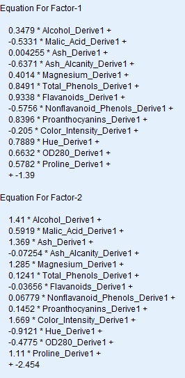
  • The variables which were 14 in number were reduced to two factors
  • The equation of two factors were given above.
  • The logistic regression models gives the results with an accuracy of 97.23 %
  • The prediction of spss modeler for the testing set is perfect with a misclassifier of just 1 which is the same as the python.( the previous post)
Post your comments and views.

Thursday, April 26, 2018

What’ there in wine ? Principal component analysis problem- Data analytics


­
What’ there in wine ?
Which wine is suitable for a typical customer segment and what are their preferences ?
The  objective behind it is to understand the mathematics, and the datascience part behind it. This model can be replicated to any other similar business problem .
Here is a classical problem to understand the PCA- Principal component analysis. There are 178 records, 12 variables ( components to prepare the wine), which is distributed for three categories of customers.

Problem statement: Need to identify which are the variables that contribute to the preference of the customer. Identify the variables which has the maximum variance. Visualize the learning of the machine.
The task is to classify the category of customers and their taste. For each new wine the model will be used to predict to which customer segment this could be recommended.
This is an example for unsupervised learning , where we ask the machine to learn on its own without giving any instructions in between the program.
Let’s dive deep


Importance of PCA
            1.Chooses “m” variables out of “n “, where  m < n
            2. The chosen m variables explains the most of the variance in the dataset.
Now let us workout this problem in python.
As a standard process,

  •      Divide the dataset into test set and training set, where the learning made using the training set is plugged in the test set to see the results.
  • ·        Scaling the data to have uniform distance between them and the other variables. Where there are a number of modes to do scaling, here I have preferred to use standard scaling. This is available as a package  in python in sklearn.

  •  Import the PCA. Initially set the no. of components as None and after viewing the results of the PCA, we could decide the number of variables.
  •   Here it is decided as two variables which had maximum variance.
  •  After  we have got the top two variables , we shall use the logistic regression to identify the effectiveness and check whether it has classified as planned.
  •  Let us see the results, the confusion matrix.
  •     We have got a wonderful results as it has predicted 0 as 0 in 14 occasions, 1 as 1 in 15 , and 2 as 2  in 6, with a misclassification of one occassion. 
  • ·     Use matplotlib to visualize the results.


Monday, April 16, 2018

How to start a Natural Language Processing- Part 1

Well, you need to understand your business,
You are getting feed back from your customers , the feed back is  in the form of text and there is a question at the last,  an objective question, yes/ no type or  will you recommend or not type.
 You have say a 1000 s of such feed backs. Do you think it is easy for a human being to sort, find and get the sentiments of your customers ?
Here comes the algorithm of NLP- Natural Language Processing.
Python is used to understand the scenario.
Pre processing the input data 
Before you input the data make sure you give the tsv, ie the tab separated file , TSV file as the CSV contains comas which the classifier mis interprets it. Secondly make sure you use a code to avoid the double quotes, "quoting=3".
Clean the text

  1. Choose the appropriate words that reflect the positive sentiments  such as like, love, happy ,etc [ the tenses liked , loved  should be grouped  to get minimum no. of words for computation]
  2. use the library function re ie. import re
  3. re.sub() function will help to remove the special characters
  4. lower() function converts all the characters into lower characters
  5. Till now we have seen that we need to get a sentence, remove the special characters, convert into lower cases.
  6. Convert the sentences into words. use a package nltk which does this function.
  7. use stopword to choose only the relevant word in the language which represent the sentiment
  8. We need to separate the steam and the root word . For instance , liked need to be taken as 'like'.  as separate function PorterStemmer is available for this activity.


Friday, April 13, 2018

What are your chances to get a PGP Management call from IIM A ?

Here is a detailed analysis done to understand the past history of admission process of IIM Ahamedabad. This analysis is done in tableau, which I was thoroughly enjoying while doing it.

While it is not necessary that the same pattern repeats, this could be considered as a reference while someone prepares for it.

Most of the time spent was to make the  data understandable by the machine,convert those as measures and dimensions, formating the data type etc.

How many apply for a batch ?? 
The next visualisation can help us to understand the potential chances of being a female / an engineer/ Master's professional.

Sector wise analysis of People joined


What minimum gmat score is required ? what was the past ?


Disclaimer: The data was fetched from the open source from their website, the author claims no liability for the individual's course of action. While  atmost care is taken for the analysis, ensuring the accuracy of the information is one's own responsibility .

Monday, April 2, 2018

Power of sas visual analytics

Wouldn't it be wonderful if you were given a set of data of some 1500 staff  and identify the reasons for attrition.
SAS visual analytics has the ability to predict the  classification / combination with a level of accuracy. A sample work is done to understand the software's performance. Simply reduced tonnes of workload.
Partition- 70-30% training and validation


A sample probability  of a particular combination of parameters is given in below figure

Thursday, March 29, 2018

IMPUTING DATA IN PYTHON

A very basic and important thing in the data analysis and in machine learning is imputing. We cannot delete the record as it has some missing values. It may contain some valuable information. One of the strategies is to impute. That is we could put the mean values of the row/ column depending on the need and fill the cells. Python has some in built packages which does this function. I am giving the steps involved in doing this.

Sunday, March 25, 2018

Indian car buyer's behaviour- using SAS VISUAL ANALYTICS

Here is an interesting insight of  car buyer's pattern.
A sample of 99 cars is analysed. 13 variables. Have a look of the data audit done using SPSS Modeler.


Now comes the slicing and dicing part.
We can observe that the a post graduate whose wife is working has a more chance of buying a car. 
secondly compared to the education level post graduates bought the higher percentage of cars.


The box plot below gives an idea about the salary range, mean , median, mode, make of the car and its count. An example of good visualisation in one graph.


Does Home loan has an impact ? find the answer below...


What is the impact of count when it comes to home loan ?


Thanks Ramprsath for support and technicals