
Thursday, March 29, 2018
IMPUTING DATA IN PYTHON
A very basic and important thing in the data analysis and in machine learning is imputing. We cannot delete the record as it has some missing values. It may contain some valuable information. One of the strategies is to impute. That is we could put the mean values of the row/ column depending on the need and fill the cells. Python has some in built packages which does this function. I am giving the steps involved in doing this.

Sunday, March 25, 2018
Indian car buyer's behaviour- using SAS VISUAL ANALYTICS
Here is an interesting insight of car buyer's pattern.
A sample of 99 cars is analysed. 13 variables. Have a look of the data audit done using SPSS Modeler.


A sample of 99 cars is analysed. 13 variables. Have a look of the data audit done using SPSS Modeler.

Now comes the slicing and dicing part.
We can observe that the a post graduate whose wife is working has a more chance of buying a car.
secondly compared to the education level post graduates bought the higher percentage of cars.

The box plot below gives an idea about the salary range, mean , median, mode, make of the car and its count. An example of good visualisation in one graph.

Does Home loan has an impact ? find the answer below...

What is the impact of count when it comes to home loan ?

Thanks Ramprsath for support and technicals
Friday, March 23, 2018
Tableau- representing world data
Disclaimer: While I don't have the factual verification of the data, the example shown here is for academic-illustration purpose only.
The participating countries : 216
No. of variables for analysis(Parameters): 45
The mode of representation of graphs is what need to be analysed. I am giving my own mode of visualisation and understanding of the dataset.
Sample visualisation of data:
Top 30 countries in birth and death rate.


The participating countries : 216
No. of variables for analysis(Parameters): 45
The mode of representation of graphs is what need to be analysed. I am giving my own mode of visualisation and understanding of the dataset.
Sample visualisation of data:
Top 30 countries in birth and death rate.

2. Top countries in gas and oil consumption

3.Other parameter like debt, infrastructure, GDP

GDP: Size shows % of Total GDP. The marks are labeled by Country. The data is filtered on sum of GDP, which ranges from1,500,000 to 11,750,000,000,000. The view is filtered on % of Total GDP, which from 2.00% to 17.46% .
4. How is the life expectancy and the mortality rate?

Thursday, March 22, 2018
Visual analysis using SAS
First hand experience of SAS Visual analytics: Needless to mention that SAS has wonderful capabilities , a work is done to experience the features of it.
Meta data
Cars produced in the three regions- US, JAPAN and EUROPE
Year of production : 1971- 1982
Objective: Understand the data set - get information about the pattern , likes and dislikes, give statistics about the measures .
 1.The above picture gives information about the split of cars in each of the areas.
2. The no.of cylinder and the area scatter plot gives an information that Europe had cars which were popular in the 5 cylinder car segment, While Japan had not any 5 cylinder cars instead had only 3. Both those were not having popular cars which had 8 cylinders. US cars were popular only with even number of cylinders.
 3.The below graph depicts that there exists a negative correlation between the weight and the miles per gallon MPG. When segmented between the areas, Japan was focusing only in the lightweight segment and more in MPG. Europe was interested in lower weight cars also interested in MPG, whereas US segment cars were having higher weights and lesser botheration in MPG.
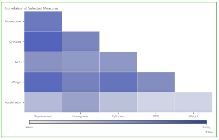
 4. SAS also give the correlation matrix- Even if one does not have any knowledge in the particular domain, this coorelation can give lot of insights.

MORE TO COME.......
Meta data
Cars produced in the three regions- US, JAPAN and EUROPE
Year of production : 1971- 1982
Objective: Understand the data set - get information about the pattern , likes and dislikes, give statistics about the measures .

2. The no.of cylinder and the area scatter plot gives an information that Europe had cars which were popular in the 5 cylinder car segment, While Japan had not any 5 cylinder cars instead had only 3. Both those were not having popular cars which had 8 cylinders. US cars were popular only with even number of cylinders.


MORE TO COME.......
Wednesday, March 21, 2018
Analytics in Banking - acceptance of Personal loan
LOGISTIC REGRESSION
A major portion of business of banks is lending. Personal loan has a major share in lending. Wouldn't it be interesting if with the given set of data and the analytics ability of the software predict who is in need of loan and the chance of accepting the loan? let us look deeper into it.
Data
Description:
|
|
ID
|
Customer
ID
|
Age
|
Customer's
age in completed years
|
Experience
|
#years
of professional experience
|
Income
|
Annual
income of the customer (Rs 000)
|
PinCode
|
Home
Address pin code.
|
Family
|
Family
size of the customer
|
CCAvg
|
Avg.
spending on credit cards per month (Rs 000)
|
Education
|
Education
Level. 1: Undergrad; 2: Graduate; 3: Advanced/Professional
|
Mortgage
|
Value
of house mortgage if any. (Rs ###)
|
Personal
Loan
|
Did
this customer accept the personal loan offered in the last campaign?
|
Securities
Account
|
Does
the customer have a securities account with the bank?
|
CD
Account
|
Does the
customer have a Fixed deposit (FD)
account with the bank?
|
Online
|
Does
the customer use internet banking facilities?
|
CreditCard
|
Does
the customer use a credit card issued by WWWXXXYYY Bank?
|
Steps:
1.Fix the appropriate data type for the given data
2.Choose the tool which can be used to fix the solution. A typical tool choosen is the spss modeler.
Can choose the appropriate tool of your expertise.
3. A model is created with the following nodes.

4. Source tab- excel node to input the data
5. Output tab- table node to see the input data
6. Output tab- Data audit node to see the quality of data
7. The data is made to have a required partition- may be 60- 40 % one for testing and another for training.
8. A type node is connected to make a Logistic regression
Before we move on to the logistic regression, one should understand the need for it.
Linear regression fits the data given which can predict the outcome depending upon the input given.
Logistic regression : When we need to get the output as Yes / No- 0 or 1, Acceptance/ Non acceptance, we are in need of this model. A detailed difference between the models and the mathematical variation is not given at this point of time.
9. Here our objective is to know whether one will have a need / accept a PL or not and therefore this modeling has an appropriate fit.
10. Once the modeling is done we are in need of its evaluation and find the data who are potentially in need.
11. This process is know as lifting. We need to identify the data/ decimate it and get the prospective list.
12.The whole objective is to have the maximum effectiveness and attempt only the prospective clients. This reduces the time, effort and of course the money involved in campaign, attempting, meeting etc to a greater extent.
.
Tuesday, March 20, 2018
Tableau a tool in analysis of attrition
I have experience in few tools for data visualisation. Among those I believe Tableau is a versatile tool .
Can Tableau be used as a tool for data analysis and prediction. A work is made to understand the data of employee attrition using Spss Modeler. The CART alogirthm classifies based on the users requirements and gives a detailed analysis.
The same data is used in the tableau for visualisation.
Even though Spss modeler has features to draw graph- the graph board, Tableau has options to drill down, filter, and abilities which can be easily made and understandable.( Cognos BI too has the ability).
A sample data of attrition of employees need to be analysed. How was the problem approched ?
Is it significant ? can we pin point women attrition ?
All the above questions were answered in one single dashboard / storyboard in Tableau.
I shall present those and give a brief outline about them.

- In the above visualisation, the first attempt was made to identify the count of women attrition.
- Department wise distribution was taken
- How many of them were in the current role ? This gives an understanding that majority were in the first fews years .
- Is there any relation with the marital status?
- The major factor - single women is identified.
- What % of single women is leaving the organisation
- Is travel a factor?
- Tableau has options to get detailed analysis in one single page the dashboard and the storyboard can convert it into the required format.
- The above is a sample of the workdone to analyse how the information can be split , viewed and used in gaining Business Intelligence.
All these above in the dashboard is not only useful for getting the visualisation of the past, but also helps in getting future predictions about attrition.
Sunday, March 18, 2018
Predictive analysis for a telecom company
Is it possible to gain intelligence / impart intelligence make a machine learn from the data and predict something ?
The current technology gives directions to this. Today with the computing capability of the latest machines/ highly advanced software tools / development of human brain makes it possible.
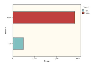
Supposing we have a data set to understand the churn behaviour of the customer from one service provider to another.
For instance we have the following data about the customer
The first objective is to predict whether the customer will sustain with the telecom provider.The second objective is to understand which category of customers will tend to churn.
Where will we start?
1. First understand the type of data. Account length -say in days-- so integer - continuous variable
2. Classify what kind of variables these belong to--> continuous, nominal, categorical, ordinal etc
3. Fix the target variable- in our case it is the churn- > Yes / NO.
4. Get the statistics of the churn customers.
5. Fix the drivers- ie the variables which lead to the decision.
Look at the example.

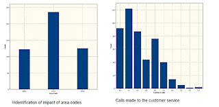
In the above , the four variables are narrowed down and fixed as drivers.
6. Use suitable alorithms to solve the problem. A typical algorithm that can be used is Classification and regression tress- C & RT / CART algorithm.
7. SPSS Modeler has an option to make the tree grow interactively. Starting with the major driver- (from any of the above variables), and drilling down further can give lot of insights to the problem.
The current technology gives directions to this. Today with the computing capability of the latest machines/ highly advanced software tools / development of human brain makes it possible.
Supposing we have a data set to understand the churn behaviour of the customer from one service provider to another.
For instance we have the following data about the customer
State
|
Eve Calls
|
Account Length
|
Eve Charge
|
Area Code
|
Night Mins
|
Phone
|
Night Calls
|
Int'l Plan
|
Night Charge
|
VMail Plan
|
Intl Mins
|
VMail Message
|
Intl Calls
|
Day Mins
|
Intl Charge
|
Day Calls
|
CustServ Calls
|
Day Charge
|
Churn?
|
Eve Mins
|
The first objective is to predict whether the customer will sustain with the telecom provider.The second objective is to understand which category of customers will tend to churn.
Where will we start?
1. First understand the type of data. Account length -say in days-- so integer - continuous variable
2. Classify what kind of variables these belong to--> continuous, nominal, categorical, ordinal etc
3. Fix the target variable- in our case it is the churn- > Yes / NO.
4. Get the statistics of the churn customers.

5. Fix the drivers- ie the variables which lead to the decision.
Look at the example.


In the above , the four variables are narrowed down and fixed as drivers.
6. Use suitable alorithms to solve the problem. A typical algorithm that can be used is Classification and regression tress- C & RT / CART algorithm.
7. SPSS Modeler has an option to make the tree grow interactively. Starting with the major driver- (from any of the above variables), and drilling down further can give lot of insights to the problem.
Thursday, March 15, 2018
TAMILNADU BUDGET 18-19 ALLOCATION- Data visualisation
A typical example of data visualisation. In the speech of the finance minister, it is not an easy task to grab all the information . I have made an attempt to segregate the information into three categories :- 1. Allocation more than 1000 crores. 2. allocation 100 to 1000 crores .3. Allocation upto 100 crores.
Now it could be understood , which contribute more.
Secondly, if we try to put in a single chart 20 crore budget cannot be seen as it is negligible when compared to 27205 crores.


Tuesday, March 13, 2018
Manufacturing data of India
Source of Data : GOI
The actual data of Manufacturing data upto 2015 is analysed as under. Let us see the output.
The Meta data
1.Industry Description
2.Number of Factories
3.Productive Capital
4.No. of Employees
5.Total Output
6.Net Value Added
Units for the above is not available to substantiate.
f<-read.csv("mfg.csv")
###########################################################
totalop<-tail(sort(f$Total.Output),5)
totalop<-sort(totalop,decreasing =TRUE)
print("The top five outputs values and the corresponding industries are")
for(i in 1:5)
{
a[i]=which(f$Total.Output==totalop[i])
}
print(paste(f$Industry.Description[a],totalop))
print("************************************************")
##############################################################
print("The top five Segments with more employee count are")
totalemp<-tail(sort(f$No..of.Employees),5)
totalemp<-sort(totalemp,decreasing =TRUE)
for(i in 1:5)
{
a[i]=which(f$No..of.Employees==totalemp[i])
}
print(paste(f$Industry.Description[a],totalemp))
print("************************************************")
###############################################################
print("The top five Segments with more Factories")
totalfac<-tail(sort(f$Number.of.Factories),5)
totalfac<-sort(totalfac,decreasing =TRUE)
for(i in 1:5)
{
a[i]=which(f$Number.of.Factories==totalfac[i])
}
print(paste(f$Industry.Description[a],totalfac))
print("************************************************")
###############################################################
print("The top five Segments with more Productive capital")
totalpc<-tail(sort(f$Productive.Capital),5)
totalpc<-sort(totalpc,decreasing =TRUE)
for(i in 1:5)
{
a[i]=which(f$Productive.Capital==totalpc[i])
}
print(paste(f$Industry.Description[a],totalpc))
print("************************************************")
##############################################################
print("The top five Segments which added more value")
totalva<-tail(sort(f$Net.Value.Added),5)
totalva<-sort(totalva,decreasing =TRUE)
for(i in 1:5)
{
a[i]=which(f$Net.Value.Added==totalva[i])
}
print(paste(f$Industry.Description[a],totalva))
********************************************************************************
OUTPUT
[1] "The top five outputs values and the corresponding industries are"
[1] "Manufacture of refined petroleum products 877330.93"
[2] "Manufacture of basic iron and steel 607845.93"
[3] "Manufacture of basic chemicals fertilizer and nitrogen compounds plastics and synthetic rubber in primary forms 272185.06"
[4] "Others 270214.59"
[5] "Spinning weaving and finishing of textiles. 247030.36"

[1] "************************************************"
[1] "The top five Segments with more employee count are"
[1] "Spinning weaving and finishing of textiles. 1182643"
[2] "Manufacture of nonmetallic mineral products n.e.c. 864994"
[3] "Manufacture of other food products 822043"
[4] "Preparation and spinning of textile fibers 714510"
[5] "Manufacture of basic iron and steel 714307"

[1] "************************************************"
[1] "The top five Segments with more Factories"
[1] "Manufacture of nonmetallic mineral products n.e.c. 23361"
[2] "Manufacture of grain mill products starches and starch products 19010"
[3] "Manufacture of grain mill products 18244"
[4] "Spinning weaving and finishing of textiles. 13134"
[5] "Manufacture of other fabricated metal products metalworking service activities 10713"
[1] "************************************************"
[1] "The top five Segments with more Productive capital"
[1] "Manufacture of basic iron and steel 472212.59"
[2] "Others 233988.44"
[3] "Manufacture of refined petroleum products 191739.79"
[4] "Manufacture of nonmetallic mineral products n.e.c. 133685.59"
[5] "Spinning weaving and finishing of textiles. 129478.7"
[1] "************************************************"
[1] "The top five Segments which added more value"
[1] "Manufacture of basic iron and steel 119211.95"
[2] "Manufacture of pharmaceuticals medicinal chemical and botanical products 58152.85"
[3] "Manufacture of refined petroleum products 47180.63"
[4] "Manufacture of other chemical products 46698.02"
[5] "Others 44645.49"

Monday, March 12, 2018
Using spss modeler- data type issues
A typical example of data cleansing
There are chances that we encounter issues with the conversion of data types .
A file of type csv need to be given as a source of input to spss modeler for analysis.
Except the first column all other column contains numbers- integers/ float or decimals.
But surely of non character data types.
When the source file is added , the type of data is displayed as nominal instead of integer.
What to do with this kind of issue ? How to handle it ?
- Check the various options given in the source node- var

- There are possibilities that space, tab were checked. Need to decide whether those are required.
- Analyse the source data whether any special characters were added. Ex- comma, semi colon, hyphen etc. These create troubles for the modeler to understand the type of data.
- If needed delete those without loosing the context of data or rename it if needed.
- These four simple steps can make the data pure of its form
- After keying in the file to the modeler, check whether the required data type is understood by the software. Now it is possible to change/ modify , add dummies, and edit according to our need.

Learning from the experience through blogs, forums saves lot of time in the during data modeling.
Sunday, March 11, 2018
Analysing the employment data from Indian railways
Source data from GOI
Credits: Ramprasath
Here is an interesting data to analyse.
How was the employment generated by Indian railways in the past 15 years ? Here is the insights.
The code was developed in R
Data preparation:
The rows and column are transposed to make it easy and readable.
setwd('d:/suman')
job<-read.csv('railwayjob.csv')
typeof(job)
for (j in 2:15)
{
maxval<-max(job[2:19,j],na.rm = TRUE)
minval<-min(job[2:19,j],na.rm = TRUE)
y<-which(maxval==job[,j])
z<-which(minval==job[,j])
ans<-job[y,1]
ans2<-job[z,1]
print(paste("sl = ",j,", min = ",ans2))
print(paste("sl = ",j,", max = ",ans))
}
This is a simple data set for a period of 15 years and 20 rows.Each indicate the railway zone.
The results are interesting:
Northern zone are contributing more for the employment generation.
The least were the kolkata. More visualization can be added to this.
Saturday, March 10, 2018
Working with data which has 1 lakh records
An interesting point of entry...
So you have decided to put your hands on in analysing the data which has atleast one lakh 1,00,000 records, ie one lakh rows in an excel sheet with 'n' number of columns.
How should you start with ?
A typical example I have worked is a unsupervised learning process.
Go with baby steps doing as follows
1. Use cross tabs- find the relation between the columns. There may be a relation between column three and column 5. Any visualization tool like- R, Spss modler, tableau can give this.
2. Use box plots to find out the skewness of the variables. Variables are the the headers of the column.

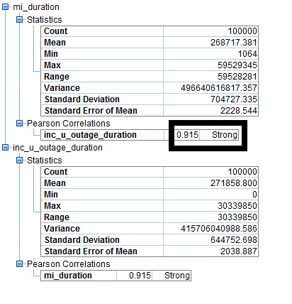
3. Find the correlation between the variables. It may be strong, medium or weak. If the correlation is strong then we could discard one of the variables.

4. Forming clusters- using suitable algorithm- say K - Means cluster try using two clusters and check the cluster quality. If the cluster quality is less than 0.5 it means that there are few more possibilities of clusters.

5. Try increasing the clustering of the of the variable data points,till an optimum value of clusters are obtained.
6. Understand the variables that drive the data. If the drivers are categorical regression analysis is not the best mode to analyse.
7. A frame work for clustering is given as below- Modelled in spss modler.
 8. The above is the exploration process. Now identify the drivers and proceed with the model.
So you have decided to put your hands on in analysing the data which has atleast one lakh 1,00,000 records, ie one lakh rows in an excel sheet with 'n' number of columns.
How should you start with ?
A typical example I have worked is a unsupervised learning process.
Go with baby steps doing as follows
1. Use cross tabs- find the relation between the columns. There may be a relation between column three and column 5. Any visualization tool like- R, Spss modler, tableau can give this.
2. Use box plots to find out the skewness of the variables. Variables are the the headers of the column.

3. Find the correlation between the variables. It may be strong, medium or weak. If the correlation is strong then we could discard one of the variables.
4. Forming clusters- using suitable algorithm- say K - Means cluster try using two clusters and check the cluster quality. If the cluster quality is less than 0.5 it means that there are few more possibilities of clusters.

5. Try increasing the clustering of the of the variable data points,till an optimum value of clusters are obtained.
6. Understand the variables that drive the data. If the drivers are categorical regression analysis is not the best mode to analyse.
7. A frame work for clustering is given as below- Modelled in spss modler.

Wednesday, March 7, 2018
An algorithm for assignment problem in R
A small algorithm was written in R which will identify the optimum assignment in a ship.
The problem was tested for assigning loads in 3 trucks in a ship. It could be expanded to n ships and their combination. The algorithm was tested with some combination of values. You may pass on your comments and views for the improvement .
Assignment problem link
The problem was tested for assigning loads in 3 trucks in a ship. It could be expanded to n ships and their combination. The algorithm was tested with some combination of values. You may pass on your comments and views for the improvement .
Assignment problem link
Monday, March 5, 2018
Data Analysis and analytics
Is data analysis and data analytics the same?
While many seek the clarification between these , I have made a small video to make the viewers understand the difference .The process in which we have full control over the data and the outcome is not going to depend on external factors it is analysis.
In the case of example I have given in farming, the moisture of the soil, area, type of soil are the information which is known( Internal), Rain, water flow, weather are few things which are external.
prediction parameter: Yield
In the second example: the prediction is whether the person will have / chances to have a disease of a particular kind.
DATA ANALYSIS
|
DATA ANALYTICS
|
|
Ex 1
Farming
|
Type of soil
,moisture
|
Weather,
water flow , rain, manure composition
|
Ex 2
health care
|
Age, Gender
|
History of
illness, lifestyle, location, occupation
|
Ex 3
Banking
|
Age ,gender
,occupation
|
Annual
income, sector
|
Watch , share and give your comments.
Thanks : Rohit kumar - IBM for the inputs
Sunday, March 4, 2018
How popular are the e-commerce sites
How popular amazon, flipkart and snapdeal are in socialmedia ?
Disclaimer: The authors have no interest in the business of
the companies mentioned and have no stake in either of these.
The work is mainly focused for the purpose of academics. The
geographic location considered is India. Duration of the survey 18 Feb 2018 to
04 March 2018. Tool used IBM WATSON.
The report sought was based on the following themes:
1.
Sales
2.
App
3.
Marketshare
The figure 1 shows that from 17 February
till March 4,2018 ,most of the people in social media are active in flipkart.
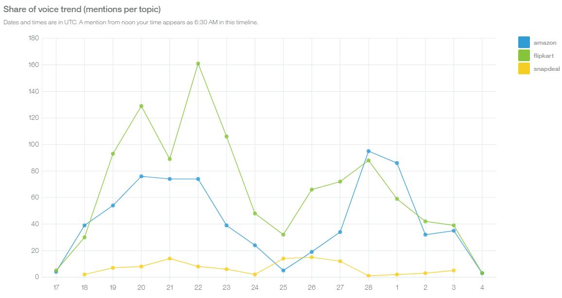
Figure1: share of voice
From Figure 2 we could understand that more than amazon
flipkart has been popular in the sales and in market share, but amazon app is
been discussed more in the social sites and in the news.

Figure 2: Popularity
of the ecommerce companies.
From the sentiment point of view ,amazon has been quite
popular. We could infer this from figure 3.But flipkart is lagging behind
snapdeal.

Figure 3 sentiment
analysis
Few terms analysed are given in the figure 4 which give the
key words which sounded positive and negative.

Figure 4 sentiment
terms.
Thanks,
Subramanian
Data Science Professional
Technical Support
Ramprasath
Hemacoumar
Subscribe to:
Posts (Atom)