Saturday, April 28, 2018

What's there in wine ? Part 2 PCA- validating with SPSS Modeler

Are you curious?
Will  the data set which was analysed in  Python, when tested with spss modeler give the same result?
The data of Wine and its components were given as input to the spss modeler. The process which were done in the python was done in spss modeler.( Scaling,and partition).

The same input conditions were given, keeping the customer segment as the target variable.
Feature scaling :( x- min(x)/ range (x)


The choice of the factors was done on based on the  results of python 55 % variance.


Partition : 80-20  --> Training to testing

Number of components: 2 ( the factors which were 14 were shrunk to 2)


A filter node is connected to the nugget to filter only the factors and the customer segment to perform the logistic regression.
Finally the analysis node give the results in the form of a confusion matrix.
Let us see in detail.


Here are the results .

The confusion matrix,


So what is to be  noted ?


  • The variables which were 14 in number were reduced to two factors
  • The equation of two factors were given above.
  • The logistic regression models gives the results with an accuracy of 97.23 %
  • The prediction of spss modeler for the testing set is perfect with a misclassifier of just 1 which is the same as the python.( the previous post)
Post your comments and views.

Thursday, April 26, 2018

What’ there in wine ? Principal component analysis problem- Data analytics


­
What’ there in wine ?
Which wine is suitable for a typical customer segment and what are their preferences ?
The  objective behind it is to understand the mathematics, and the datascience part behind it. This model can be replicated to any other similar business problem .
Here is a classical problem to understand the PCA- Principal component analysis. There are 178 records, 12 variables ( components to prepare the wine), which is distributed for three categories of customers.

Problem statement: Need to identify which are the variables that contribute to the preference of the customer. Identify the variables which has the maximum variance. Visualize the learning of the machine.
The task is to classify the category of customers and their taste. For each new wine the model will be used to predict to which customer segment this could be recommended.
This is an example for unsupervised learning , where we ask the machine to learn on its own without giving any instructions in between the program.
Let’s dive deep


Importance of PCA
            1.Chooses “m” variables out of “n “, where  m < n
            2. The chosen m variables explains the most of the variance in the dataset.
Now let us workout this problem in python.
As a standard process,

  •      Divide the dataset into test set and training set, where the learning made using the training set is plugged in the test set to see the results.
  • ·        Scaling the data to have uniform distance between them and the other variables. Where there are a number of modes to do scaling, here I have preferred to use standard scaling. This is available as a package  in python in sklearn.

  •  Import the PCA. Initially set the no. of components as None and after viewing the results of the PCA, we could decide the number of variables.
  •   Here it is decided as two variables which had maximum variance.
  •  After  we have got the top two variables , we shall use the logistic regression to identify the effectiveness and check whether it has classified as planned.
  •  Let us see the results, the confusion matrix.
  •     We have got a wonderful results as it has predicted 0 as 0 in 14 occasions, 1 as 1 in 15 , and 2 as 2  in 6, with a misclassification of one occassion. 
  • ·     Use matplotlib to visualize the results.


Monday, April 16, 2018

How to start a Natural Language Processing- Part 1

Well, you need to understand your business,
You are getting feed back from your customers , the feed back is  in the form of text and there is a question at the last,  an objective question, yes/ no type or  will you recommend or not type.
 You have say a 1000 s of such feed backs. Do you think it is easy for a human being to sort, find and get the sentiments of your customers ?
Here comes the algorithm of NLP- Natural Language Processing.
Python is used to understand the scenario.
Pre processing the input data 
Before you input the data make sure you give the tsv, ie the tab separated file , TSV file as the CSV contains comas which the classifier mis interprets it. Secondly make sure you use a code to avoid the double quotes, "quoting=3".
Clean the text

  1. Choose the appropriate words that reflect the positive sentiments  such as like, love, happy ,etc [ the tenses liked , loved  should be grouped  to get minimum no. of words for computation]
  2. use the library function re ie. import re
  3. re.sub() function will help to remove the special characters
  4. lower() function converts all the characters into lower characters
  5. Till now we have seen that we need to get a sentence, remove the special characters, convert into lower cases.
  6. Convert the sentences into words. use a package nltk which does this function.
  7. use stopword to choose only the relevant word in the language which represent the sentiment
  8. We need to separate the steam and the root word . For instance , liked need to be taken as 'like'.  as separate function PorterStemmer is available for this activity.


Friday, April 13, 2018

What are your chances to get a PGP Management call from IIM A ?

Here is a detailed analysis done to understand the past history of admission process of IIM Ahamedabad. This analysis is done in tableau, which I was thoroughly enjoying while doing it.

While it is not necessary that the same pattern repeats, this could be considered as a reference while someone prepares for it.

Most of the time spent was to make the  data understandable by the machine,convert those as measures and dimensions, formating the data type etc.

How many apply for a batch ?? 
The next visualisation can help us to understand the potential chances of being a female / an engineer/ Master's professional.

Sector wise analysis of People joined


What minimum gmat score is required ? what was the past ?


Disclaimer: The data was fetched from the open source from their website, the author claims no liability for the individual's course of action. While  atmost care is taken for the analysis, ensuring the accuracy of the information is one's own responsibility .

Monday, April 2, 2018

Power of sas visual analytics

Wouldn't it be wonderful if you were given a set of data of some 1500 staff  and identify the reasons for attrition.
SAS visual analytics has the ability to predict the  classification / combination with a level of accuracy. A sample work is done to understand the software's performance. Simply reduced tonnes of workload.
Partition- 70-30% training and validation


A sample probability  of a particular combination of parameters is given in below figure

Thursday, March 29, 2018

IMPUTING DATA IN PYTHON

A very basic and important thing in the data analysis and in machine learning is imputing. We cannot delete the record as it has some missing values. It may contain some valuable information. One of the strategies is to impute. That is we could put the mean values of the row/ column depending on the need and fill the cells. Python has some in built packages which does this function. I am giving the steps involved in doing this.

Sunday, March 25, 2018

Indian car buyer's behaviour- using SAS VISUAL ANALYTICS

Here is an interesting insight of  car buyer's pattern.
A sample of 99 cars is analysed. 13 variables. Have a look of the data audit done using SPSS Modeler.


Now comes the slicing and dicing part.
We can observe that the a post graduate whose wife is working has a more chance of buying a car. 
secondly compared to the education level post graduates bought the higher percentage of cars.


The box plot below gives an idea about the salary range, mean , median, mode, make of the car and its count. An example of good visualisation in one graph.


Does Home loan has an impact ? find the answer below...


What is the impact of count when it comes to home loan ?


Thanks Ramprsath for support and technicals

Friday, March 23, 2018

Tableau- representing world data

Disclaimer: While I don't have the factual verification of the data, the example shown here is for academic-illustration purpose only.

The participating countries : 216
No. of variables for analysis(Parameters): 45

The mode of representation of graphs is what need to be analysed. I am giving my own mode of visualisation and understanding of the dataset.

Sample visualisation  of data:

Top 30 countries in birth and death rate.


2. Top countries in gas and oil consumption

3.Other parameter like debt, infrastructure, GDP 

GDP:  Size shows % of Total GDP. The marks are labeled by Country. The data is filtered on sum of GDP, which ranges from1,500,000 to 11,750,000,000,000. The view is filtered on % of Total GDP, which from 2.00% to 17.46% .
4. How is the life expectancy and the mortality rate? 

Thursday, March 22, 2018

Visual analysis using SAS

First hand experience of SAS Visual analytics: Needless to mention that SAS has wonderful capabilities , a work is done to experience the features of it.
Meta data
Cars produced in the three regions- US, JAPAN and EUROPE
Year of production : 1971- 1982

Objective: Understand the data set - get information about the pattern , likes and dislikes, give  statistics about the measures .
1.The above picture gives information about the split of cars in each of the areas.

2. The no.of cylinder and the area scatter plot gives an information that Europe had cars which were popular in the 5 cylinder car segment, While Japan had not any 5 cylinder cars instead had only 3. Both those were not having  popular cars which had 8 cylinders. US cars were popular only with even number of cylinders.

3.The below graph depicts that there exists a negative correlation between the  weight and the miles per gallon MPG. When segmented between the areas, Japan was  focusing only in the lightweight segment and more in MPG. Europe was interested in lower weight cars also interested in MPG, whereas US segment cars were having higher weights and lesser botheration in MPG.
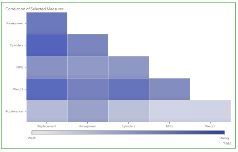
4. SAS also give the correlation matrix- Even if one does not have any knowledge in the particular domain, this coorelation can give lot of insights.

MORE TO COME.......

Wednesday, March 21, 2018

Analytics in Banking - acceptance of Personal loan


LOGISTIC REGRESSION
A major portion of business of banks is lending. Personal loan has a major share in lending. Wouldn't it be interesting if with the given set of data and the analytics ability of the software  predict who is in need of  loan and the chance of accepting the loan? let us  look deeper into it.
Data Description:
ID
Customer ID
Age
Customer's age in completed years
Experience
#years of professional experience
Income
Annual income of the customer (Rs 000)
PinCode
Home Address pin code.
Family
Family size of the customer
CCAvg
Avg. spending on credit cards per month (Rs 000)
Education
Education Level. 1: Undergrad; 2: Graduate; 3: Advanced/Professional
Mortgage
Value of house mortgage if any. (Rs ###)
Personal Loan
Did this customer accept the personal loan offered in the last campaign?
Securities Account
Does the customer have a securities account with the bank?
CD Account
Does the customer have a Fixed  deposit (FD) account with the bank?
Online
Does the customer use internet banking facilities?
CreditCard
Does the customer use a credit card issued by WWWXXXYYY Bank?

Steps:
1.Fix the appropriate data type for the given data
2.Choose the tool which can be used to fix the solution. A typical tool choosen is the spss modeler.
Can choose the appropriate tool of your expertise.
3. A model is created with the following nodes.


4. Source tab- excel node to input the data
5. Output tab- table node to see the input data
6. Output tab- Data audit node to see the quality of data
7. The data is made to have a required partition- may be 60- 40 % one for testing and another for training.
8. A type node is connected to make a Logistic regression
Before we move on to the logistic regression, one should understand the need for it.
Linear regression fits the data given which can predict the outcome depending upon the input given.
Logistic regression : When we need to get the output as Yes / No- 0 or 1, Acceptance/ Non acceptance, we are in need of this model. A detailed difference between the models and the mathematical variation is not given at this point of time.
9. Here our objective is to know whether one will have a need / accept a PL or not  and therefore this modeling has an appropriate fit.
10. Once the modeling is done we are in need of its evaluation and find the data who are potentially in need.
11. This process is  know as lifting. We need to identify the data/ decimate it and get the  prospective list. 
12.The whole objective is to have the maximum effectiveness and attempt only the prospective clients. This reduces the time, effort and of course the money involved in campaign, attempting, meeting etc to a greater extent.

.

Tuesday, March 20, 2018

Tableau a tool in analysis of attrition

I have experience in few tools for data visualisation. Among those I believe Tableau is a versatile tool .
Can Tableau be used as a tool for data analysis and prediction. A work is made to understand the data of employee attrition using Spss Modeler. The CART alogirthm classifies based on the users requirements and gives a detailed analysis.
The same data is used in the tableau for visualisation.
Even though Spss modeler has features to draw graph- the  graph board, Tableau has options to drill down, filter, and abilities which can be easily made and understandable.( Cognos BI too has the ability).
A sample data of attrition  of employees need to be analysed. How was the problem approched ?
Is it significant ? can we pin point women attrition ?
All the above questions were answered in one single dashboard / storyboard in Tableau.
I shall present those and give a brief outline about them.


  1. In the above visualisation, the first attempt was made to identify the count of  women attrition.
  2. Department wise distribution was taken
  3. How many of them were in the current role ? This gives an understanding that majority were in the first fews years .
  4. Is there any relation with the marital status?
  5. The major factor - single women is identified.
  6. What % of single women is  leaving the organisation
  7. Is travel a factor?
  8. Tableau has options to get detailed analysis in one single page the dashboard and the storyboard can convert it into the required format.
  9. The above is a sample of the workdone to analyse how the information can be split , viewed and used in gaining Business Intelligence.
All these above in the dashboard is not only useful for getting the visualisation of the past, but also helps in getting future predictions about attrition.

Sunday, March 18, 2018

Predictive analysis for a telecom company

Is it possible to gain intelligence / impart intelligence  make a machine learn from the data and predict something ?
The current technology gives directions to this. Today with the computing capability of the latest machines/ highly advanced software  tools / development of human brain makes it possible.

Supposing we have a data set to understand the churn behaviour of  the customer from one service provider to another.
For instance we have  the following data about the customer
State
Eve Calls
Account Length
Eve Charge
Area Code
Night Mins
Phone
Night Calls
Int'l Plan
Night Charge
VMail Plan
Intl Mins
VMail Message
Intl Calls
Day Mins
Intl Charge
Day Calls
CustServ Calls
Day Charge
Churn?
Eve Mins


The first objective is to predict whether the customer will sustain with the telecom provider.The second objective is to understand which category of customers will tend to churn.

Where will we start?
1. First understand the type of data. Account length -say in days-- so integer - continuous variable
2. Classify what kind of variables these belong to-->  continuous, nominal, categorical, ordinal etc
3. Fix the target variable- in our case it is the churn- > Yes / NO.
4. Get the statistics of the churn customers.

5. Fix the drivers- ie the variables which lead to the decision.
Look at the example.

In the above , the four variables are narrowed down and fixed as drivers.

6. Use suitable alorithms to solve the problem. A typical algorithm that can be used is Classification and regression tress- C & RT / CART algorithm.
7. SPSS Modeler has an option to make the tree grow interactively.  Starting with the major driver- (from any of the above variables), and drilling down further  can give lot of insights to the problem.

Thursday, March 15, 2018

TAMILNADU BUDGET 18-19 ALLOCATION- Data visualisation

A typical example of data visualisation. In the speech of the finance minister, it is not an easy task to grab all the information . I have made an attempt to segregate the information into three categories :- 1.  Allocation more than 1000 crores. 2. allocation 100 to 1000 crores .3. Allocation upto 100 crores. 
Now it could be understood , which contribute more. 
Secondly, if we try to put in a single chart 20  crore budget cannot be seen as it is negligible when compared to 27205 crores.